Homepage Slider
Brief description & marketing purpose:
The homepage slider is the centrepiece and first element on the homepage. It is intended to inform about current offers, campaigns and topics and to inspire the user directly. It slides automatically and thus offers the user a highly visually appealing element. The user should feel motivated to click further and find out about things that are currently being advertised. The slider slides automatically, but the individual teasers are also clickable.
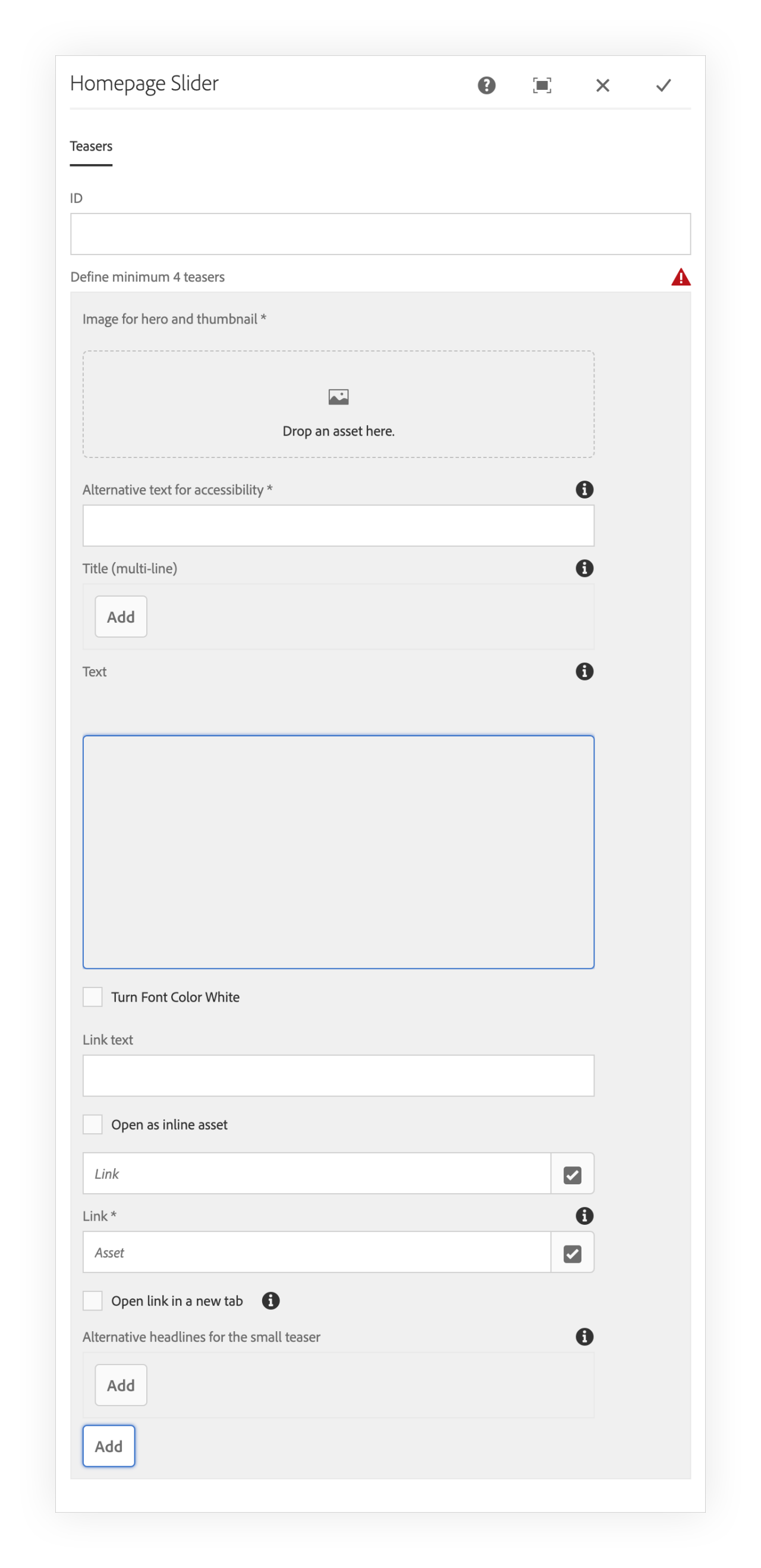
To create a new Home Carousel, you need to add at list 4 teasers. Each one should have an image (mandatory). You can add to each image the following info:
ID
Use it in case you need it for Analytics or other purposes
Image
The image you choose will be used for Hero teaser and for thumbnail in the navigation
Alternative text for accessibility
Textual alternative of the meaning or function of the image, for visually impaired readers.
Title (multi-line)
Title will display with a white background for clarity
Text
A description to display as the sub-headline for the teaser.
Turn Font Color White
Default text Color is black. Use this option for dark pictures
Link Text
You can decide which text will be displayed in CTA. If you leave this empty, the system will use the words: "Mehr erfahren"
Open as inline asset
Use this functionality in case you want to link the teaser to an asset, like a PDF document for example.
Open link in a new tab
If checked, the link will be opened in a new browser tab.
Alternative headlines for the small teaser
Thumbnails images usually get the title from the main image (Hero Teaser), but you can specify another title for the Thumbnail. Here you can write it.
Example


- Properties
- Markup
- JSON
- sling:resourceType: aida-component-library/core/components/content/homepageSlider
- textIsRich: true,true,true,true,true