Split Header Offer
Short Description:
Hero image with title, offer details with CTA and additional sub hero image, all designed in split style
Marketing Purpose:
Should convey directly to the user what the offer is about and create a desire to go with the offer.
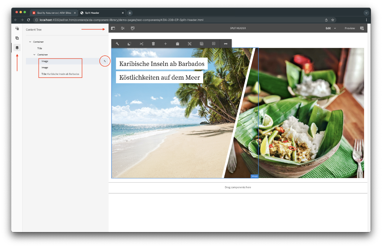
Content Tree
Same as in the Split Header component, If you are working on a small screen, you may find it difficult to select some elements of this component. To solve this, use the Content Tree feature on the side panel. There you can see all the elements and edit them.
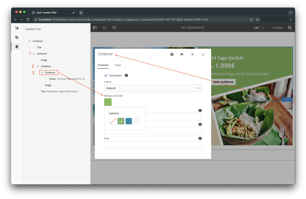
Background Color
You can change the background colors in the teaser content (text, offer CTA, etc.). To do that, select the container where the teaser is and choose the color in the Properties Tab. Important: this component uses three containers, the global container, which holds the image plus the second container, and the third, which contains the teaser. The third one is where you should change the color.
Advice: we are using an Out-Of-The-Box functionality to add colors to the container. Please contact comwrap in case you want to add or delete colors in the palette. The colors need to be added to the template policy by a developer.
Example
Due to space restrictions inside the demo area, the component is not fully displayed here and is broken. Nevertheless, you can copy and paste it into a page. It will work as expected

Karibische Inseln ab Barbados Köstlichkeiten auf dem Meer
- Properties
- Markup
- JSON
- lockParsys: true
- sling:resourceType: aida-component-library/core/components/container/container
- enableDataLayer: true
- cq:styleIds: 1653649312420
Karibische Inseln ab Barbados
Köstlichkeiten auf dem Meer