Container
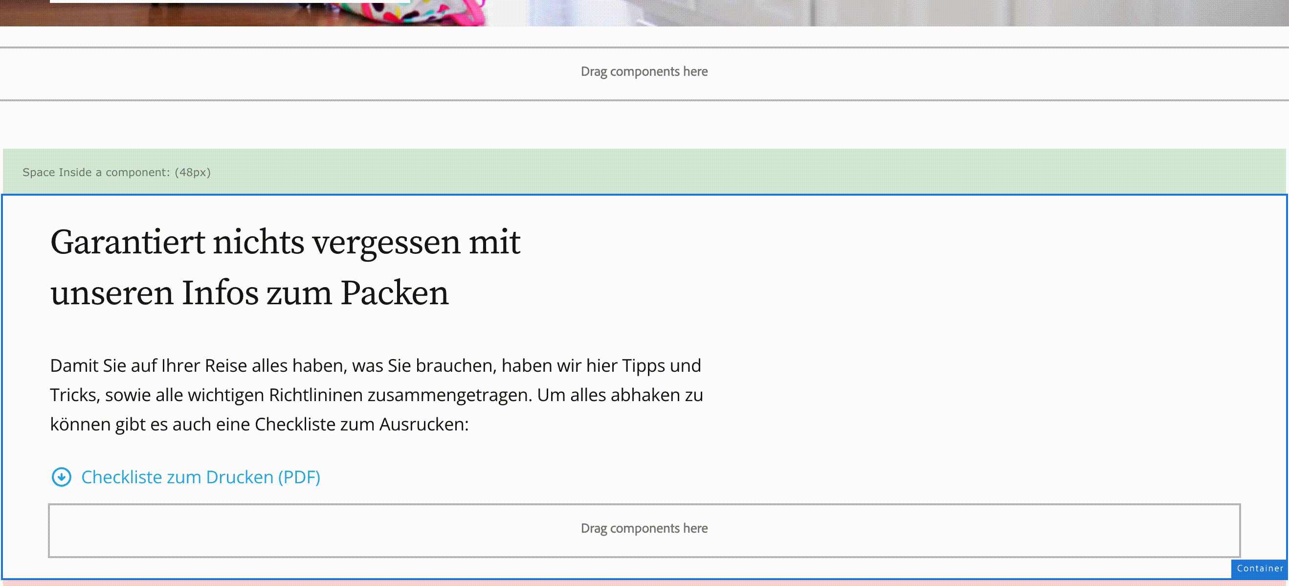
Container can be used to group together other components and apply a common layout or style. Custom background image and color can also be applied.
Responsive Grid
When in layout mode, you can resize the content components on a grid using the blue dots. Resizing will always snap-to-grid. When resizing the background grid will be shown to aid alignment. For more information about responsive behaviour visit the Adobe documentation
Styles
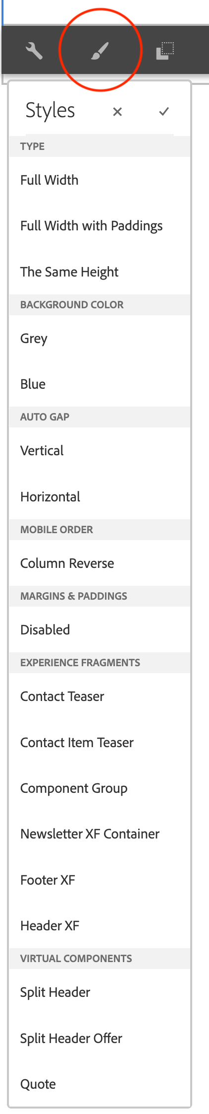
AIDA has multiple styles of containers to solve different types of layouts. Styles have been classified into four groups Type, Background Color, Auto Gap and Mobile order:
Type:
- Full Width: It is only used for the hero teaser. It keeps the margins of the content inside the grid while the image grows to the maximum.
- Full Width with Paddings: The container grows to the maximum of the viewport preserving the defined margin on the far right and far left.
- The Same Height: Objects contained within this container style are forced to maintain the same vertical size.
Background Color:
- Grey: This container is similar to the Full Width container but with a gray background. It is used for example in the Step Teaser
Auto Gap:
- Vertical: The container adds vertical spaces between the objects it contains.
- Horizontal: Similar to the previous one, only this style adds the space between the objects horizontally.
Mobile order:
- Column Reverse: This container works with two objects inside it changing the order of them ion mobile devices only.
Margins & Paddings:
- Disabled: Container usually has margins and paddings to fit design guidelines. But sometimes you need a container inside a container and don't want to duplicate paddings and margins. This functionality removes them.
Experience Fragments:
- These styles are very specific for Experience Fragments and probably you never need them, for example, Header, Footer, Contact, Newsletter etc. are already done.
Virtual Components
- Virtual Components are made using containers with specific styles. You don't need to use these styles. The components are already done and ready to be used.
Some examples
Full Width
The "Full Width" style cannot be used in this example because it is inside a demo component.

- Properties
- Markup
- JSON
- jcr:title: AIDA Reiseschutz,ab 199€ für Familien
- imageFromPageImage: false
- fileReference: /content/dam/aida-component-library/demo/images/teasers/Sample-Hero-Teaser-3.png
- actionsEnabled: false
- titleFromPage: false
- descriptionFromPage: false
- sling:resourceType: aida-component-library/core/components/content/teaser
- isDecorative: false
- textIsRich: true
- altValueFromDAM: true
- cq:styleIds: 1638263807813
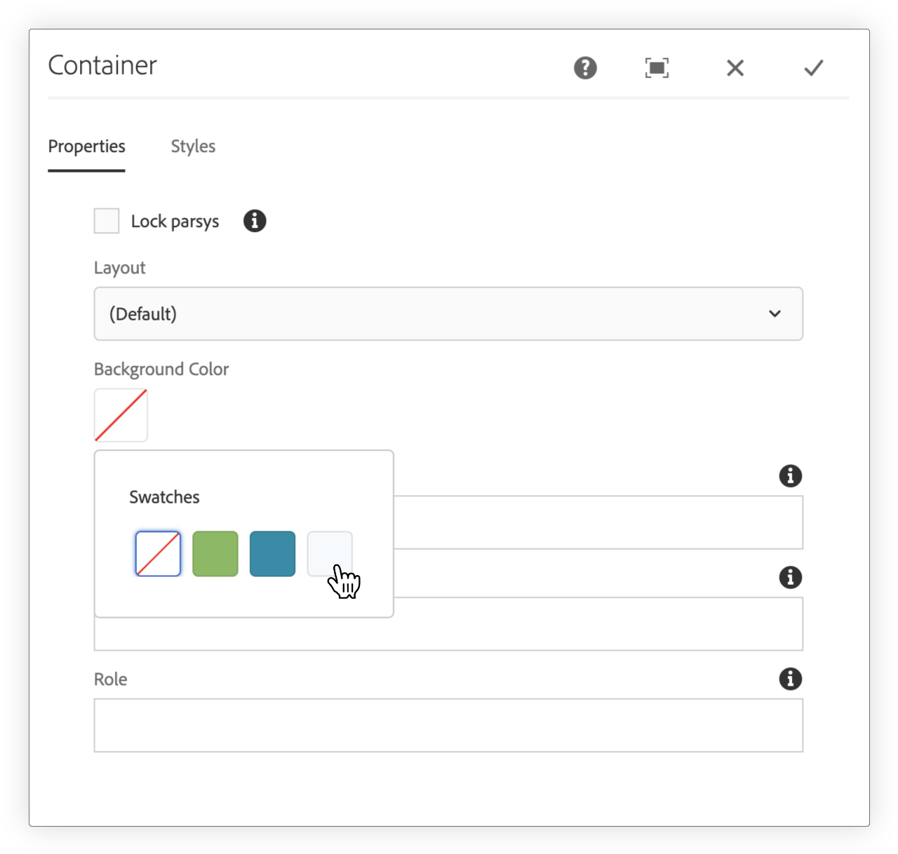
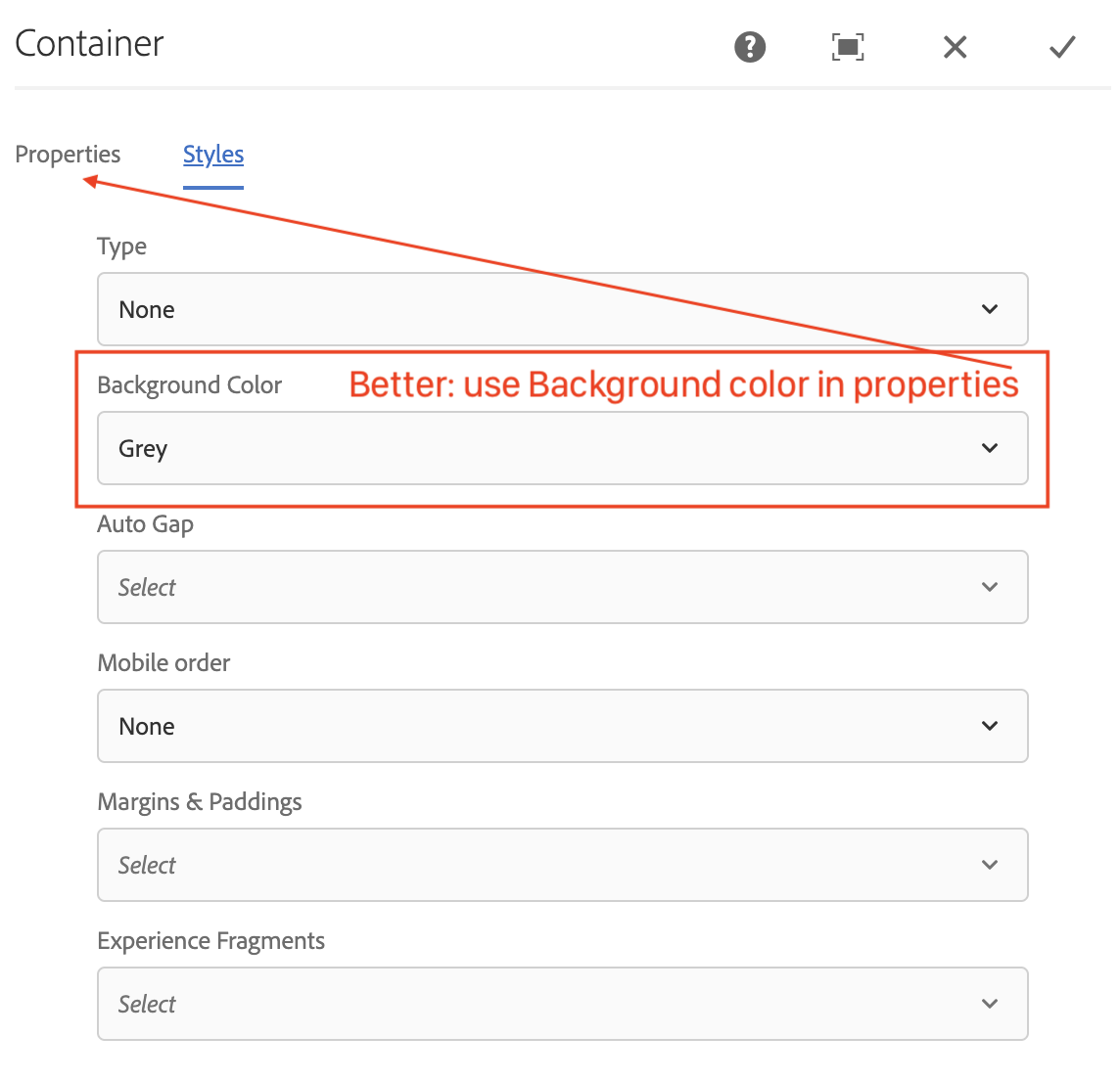
Background Color
You can change the background color on the container. AIDA designer provide the Colors. Editor can't change them or add new colors. Consult the development company if you need more colors.
- Properties
- Markup
- JSON
- layout: simple
- sling:resourceType: aida-component-library/core/components/container/container
- backgroundColor: #f4f9fe
- cq:styleIds: 1640262751155
The Same Height:
All elements inside it have equal height